Proveca
branding / print / digital / environment
Proveca are an international pharmaceutical company that have rapidly grown in recent years. Showing creative flair within an identity that needs to be very informative and data focused can be difficult. But done in the right ways, such as with print format, striking photography, thoughtful infographics and clear diagrams, can truly provide a competitive edge.
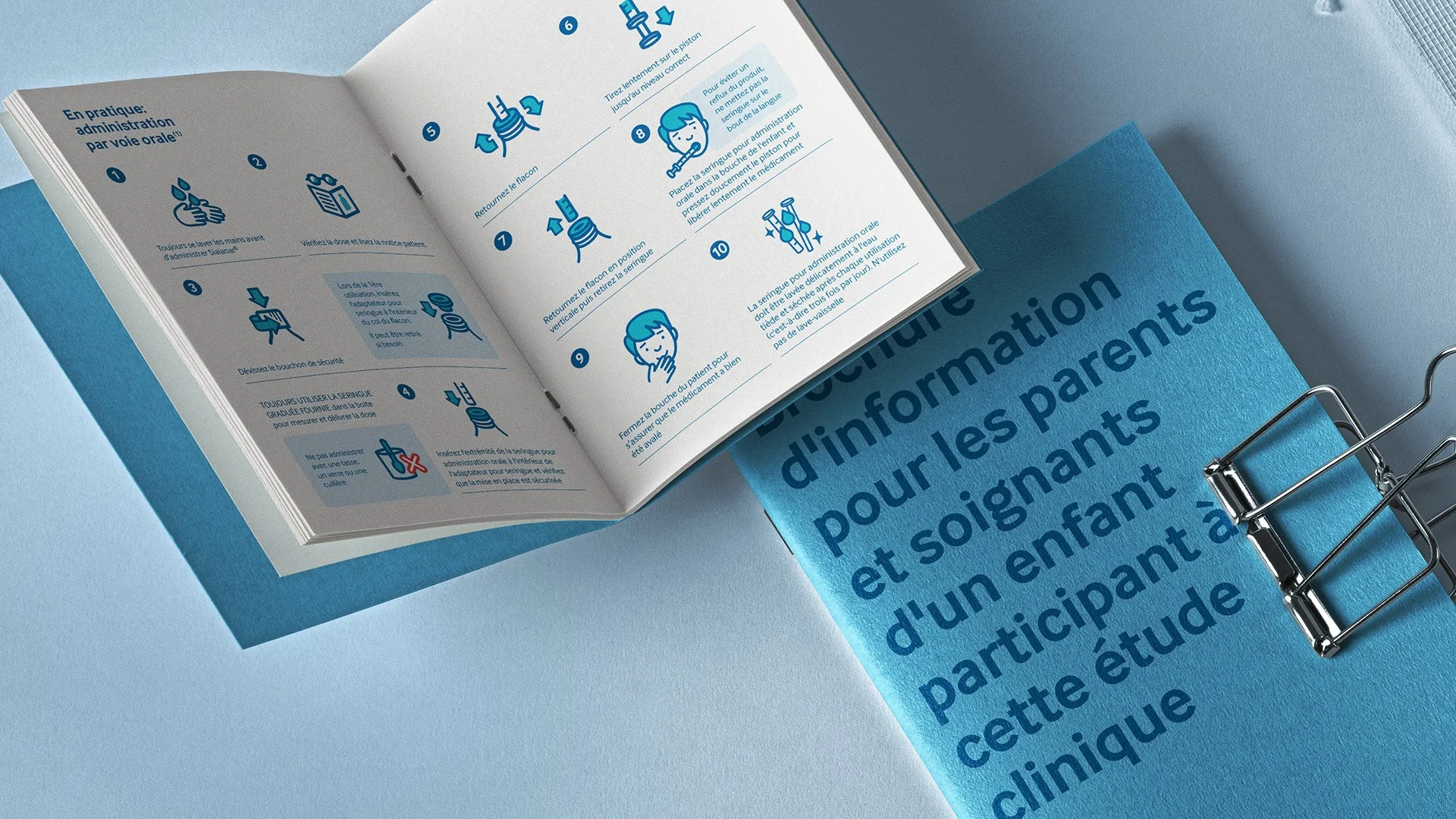
The project included creating numerous B2B materials aimed at promoting Proveca's products to diverse healthcare organisations. The designs had to be clear, professional, and effectively emphasise the advantages of the products. To achieve this, the use of a suite of icons and a bold typeface as a strong communicator were crucial.
I was part of the team at Ice House Design where they were the lead agency throughout this project. Following the brand development, the creation of brand guidelines, brochure, folder and leaflet design, exhibition stand design, internal templates, interactive PDFs, and a unique dosing calculator were all produced.
‘Proveca have worked with Iain for nearly 5 years and Iain has been very professional in all aspects and produced top quality materials and designs. The regulations around pharmaceutical marketing mean that a company is restricted around design and content. Iain was very vigilant in ensuring we complied with the code and constantly checked work to make sure there were no errors. I would highly recommend Iain’
Helen Wilmshurst, Head of Marketing, Proveca.


